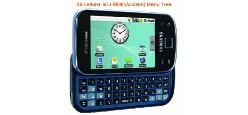
I have an iPhone which I’m generally happy with. However, I am almost certainly getting an Android handset when I replace my iPhone. I’m not going to delve into the reasons for my abandonment of an fine phone instead I want to talk about the phone line I will be adopting.
Android phones run the android operating system developed by Google and the open handset alliance. I am really excited about getting an Android phone but, at the same time, I have some hesitation because the screen shots I alway see of Android really suck.
I get the feeling the developers of the UI just wanted to put a lot of crap on the small screen. For instance, the giant clock that is a seeming requirement for all android photos is an eyesore. Who needs or wants a gigantic analog clock on their modern high tech digital device? Here is a new phone, not even released yet, with the aforementioned ugly clock:

I also dislike how the rest of the icons are seemingly scattered around the interface.
Even when shots don’t show the ugly clock they instead throw a huge calendar on the screen to replace it. Check out this image of the new HTC EVO:

It looks like a pretty nice phone but the screen UI just sucks. You can probably get rid of the calendar but I’m not sure - that isn’t a feature the screen shot can convey. Thus, am I going to be forced to page to get to more than the 8 apps that the screen still has room for?
Compare those images to the standard iPhone screen shot:

The entire screen is devoted to giving me quick access to various apps that are installed on the phone. Plus it keeps your four most common apps front and center along the bottom on every screen of apps. I can’t tell if any Android handset does something similar. If they do, and the four apps at the bottom of the HTC EVO (second image) are the equivalent to the iPhone quick launch bar then that means you only have room for 4 apps on the home screen under that ridiculous calendar.
Look, I’m willing to bet the calendar can be removed - but it (or the clock) are seemingly omnipresent in every photo of the handsets and these big ugly widgets don’t give me any confidence in the overall usability of the handsets.
It also doesn’t help that when I’ve tried to mess with newer Android handsets at our local Verizon store (yes, I know the HTC EVO is a sprint phone) the sales reps suck and are completely unhelpful.
Sure, I shouldn’t judge a book (or a phone) by it’s cover but it’s hard not to be a little uneasy about the Android handsets based on the images vendors use to advertise them. I assume the big calendar/weather widget is the “best” image they could come up with which, to me, is a bit sad.
Hopefully, when I am truly ready to buy a phone the sales people will be a skosh more helpful.